This Means This, This Means That: User’s Guide to Semiotics
I thought this was quick and interesting read about Symbols. I suppose we need to take caution of how we juxtapose parts of our symbols and even symbols next to other design elements. If we don't do it correctly, the meaning could be completely misinterpreted.
Berlo Reading
Wow. That was a lot to take in. However, I think the most important thing I learned is that designers must look at every last detail, including themselves. Attitude, knowledge and one's own prejudice comes into play more often than we think. We need to be aware of these things and control them. Also, the communication model given by Berlo is very intricate. There are a lot of things I wouldn't have ever thought about, if they weren't presented in such a convincing manner.
Thursday, October 29, 2009
Tuesday, October 27, 2009
Sunday, October 25, 2009
Video: Live Watch
Interesting communication model; lovely music; bit = binary digit; cool stop motion typography; questionable minute-long footage of flying birds for the sake of weak metaphor; was the telegraph still that popular in the 50s? haha, the narrator said "hwite"; looks like the dots are dancing; it really didn't need to be 20 minutes long, maybe 5 tops; narrator's soothing voice putting me to sleep.
Reading Summations
The reading from The Education of a Graphic Designer really struck close to heart because it aligns to a lot of my own ideas about design. Keeping design focused only on design is an erroneous and outdated idea. I know Paul Rand is considered to be a great designer, but it is time we recognize that we are living in a modern age of design. We can no longer keep our eyes blind to other practices. If we are to be effective designers, our knowledge needs to run deeper than purely design. That is not to say that we shouldn't focus mostly on design, but we should at least keep our eyes open to other areas, that would make our design more complete.
"Design should be about meaning, and how meaning can be created."
"Design should be about meaning, and how meaning can be created."
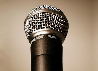
The Microphone!
Here are some words:
Loud, noise, wire, electricity, concert, singing, song, music, singer, voice, vocal, announcer, important, scream, megaphone, yell, vibration, amplification, sound, karaoke, dance, party, irritating, fun, tool, plug, ear, mouth, vocal chords.
Loud, noise, wire, electricity, concert, singing, song, music, singer, voice, vocal, announcer, important, scream, megaphone, yell, vibration, amplification, sound, karaoke, dance, party, irritating, fun, tool, plug, ear, mouth, vocal chords.
Thursday, October 22, 2009
Sounds!
1. Soundmark
2. This was supposed to be my voice overs, but it didn't export correctly, so it's just me yelling "FREAKIN' EGGS!"
3. Instrumental Made of Sound Bytes
Eggs by user1337635
2. This was supposed to be my voice overs, but it didn't export correctly, so it's just me yelling "FREAKIN' EGGS!"
3. Instrumental Made of Sound Bytes
Eggs by user1337635
Final Advertisement Re-Design


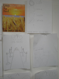
The original piece I chose to re-design was the Levy's Rye Bread magazine ad. Through careful analysis, I came to the conclusion that the it used the ethos mode of appeal. Therefore I explored both pathos and logos, as a means of persuading the reader to buy Levy's Bread. Logos was the path I choose, however, instead of showing the bread, I chose to exclude it from the piece, only alluding to it through the placement of my type. The icons that I created had to be fun and appetizing, so I made them round and playful. The type, Chaparral, also reflected this playfulness. In the end it was logos, because it persuaded the reader that the only thing missing from the rest of the delicious ingredients was the delicious bread.
Tuesday, October 20, 2009
Sunday, October 18, 2009
Icons for Poster
Thursday, October 15, 2009
Song Choices
I've picked a couple of good ones.
Ween - The F***ked Jam (instrumental)
I've chosen this song because it changes the context of the movie. It gives the clip a different mood.
The Books - Take Time (lyrical choice)
Takes time to cook an egg.
Ween - The F***ked Jam (instrumental)
I've chosen this song because it changes the context of the movie. It gives the clip a different mood.
The Books - Take Time (lyrical choice)
Takes time to cook an egg.
Jumping Jesus! PSYOP!

This studio is amazing. They are US company that does motion graphic. They mostly do commercials for big named companies, but I strongly suggest you watch ALL their videos, they are incredible.
PSYOP
How about that for some visual inspiration?
Wednesday, October 14, 2009
Vislang: Trying to Create a Word Mark
Final Animation
Untitled from Dmitri Kozlov on Vimeo.
Welp. It all came together. I learned a lot about story boarding and how it helps me cut down the unnecessary parts and keep the narrative moving. Also, transitions helped me create ties between my live-action and stop-motion aspects of the animations.
Tuesday, October 13, 2009
Tender Buttons: Final


The idea behind my design was to play off the rhythm and repetition of the words and paragraphs. Her ideas are wild, very sound based. The sounds vary with each word, and there is a definite rhythm to all her poetry. I tried to reflect that through the compositions of each poem. However, I also wanted to contrast that with a rigid, functional structure of the other elements which lead you to the poetry.
Sunday, October 11, 2009
Friday, October 9, 2009
Thursday, October 8, 2009
Tuesday, October 6, 2009
Subscribe to:
Comments (Atom)


